Mobile App

Business & Pleasure

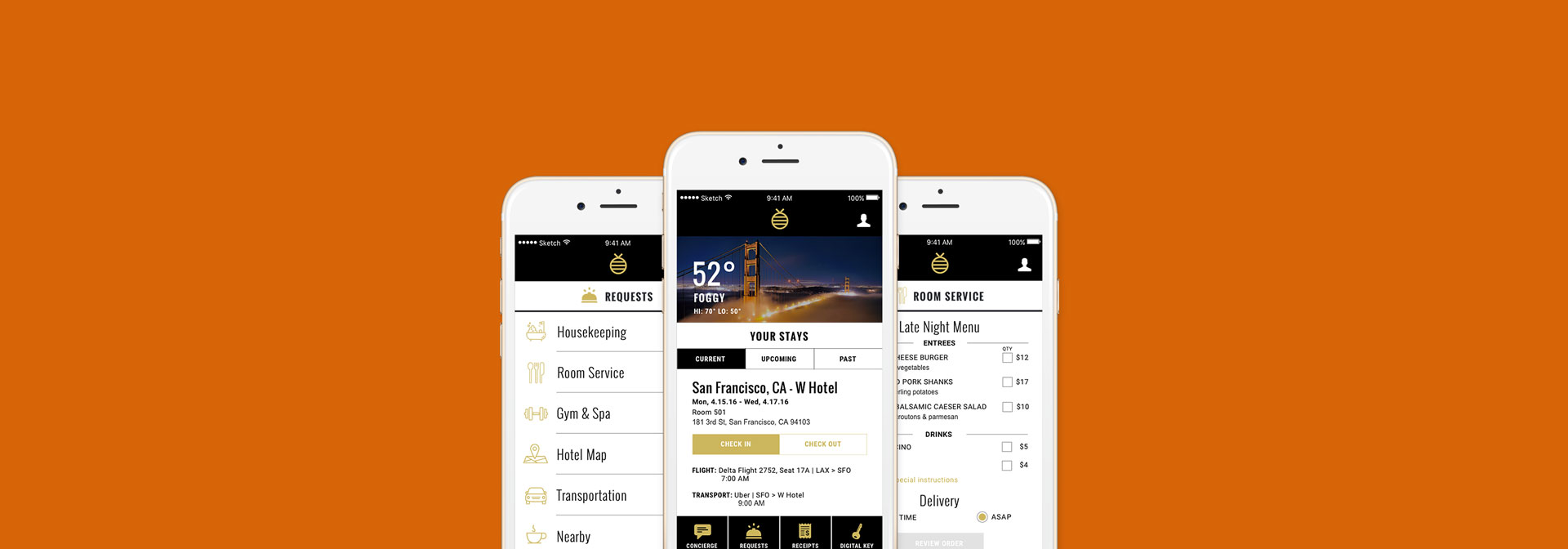
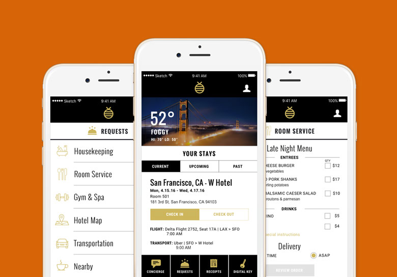
Business & Pleasure is a mobile app solution for business travelers who need to maximize the little free time they have while staying in a hotel. The app is built on the foundation that convenient communication is the ultimate luxury.

Project Overview

Challenge

Extremely busy business travelers have to manage their stay at many hotels digitally; however the lack of communication with the front desk causes a stress on time, resources, and happiness.

Solution

Streamline business travel so it becomes the ultimate experience - by automating check-in and check-out, creating digital requests, and allowing business travelers to manage all aspects of their trip all in one digital place.

Team

I collaborated with Niralee Patel and Sara Coon. We each contributed equally to the research, ideation, prototyping, and usability testing.

Role

Researcher, Information Architect,
UX | UI Designer, Visual Designer

Methods

Interviews, Competitive/Comparative Analysis, Personas, Contextual Inquiry, Wireframing, Usability Testing

Tools

Apptourage, Keynote,
Photoshop, Sketch, Marvel

Research & Key Findings

Through our initial research into the hotel industry, including interviews and C&C analyses, we found there was a gap in the market for business travelers and decided to focus our efforts on streamlining their travel process.
App Screenshot

Initial Research & Development

Competitive/Comparative Analysis

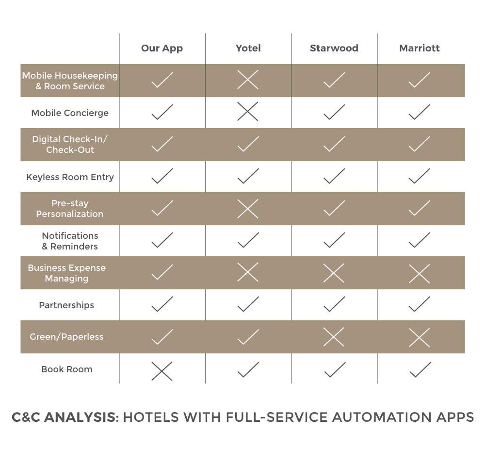
We commenced our research by conducting a C&C analysis with existing hotel apps and the services they offer. The apps provide a lot of useful functions for their guests, but we realized they only work within their own hotel chains. Currently, there is gap in the market for third-party hospitality apps that cater specifically to business travelers.

Online Reviews & Concept Map

We then searched online for user reviews of the competing companies' apps. The reviews were mostly positive, but many of them expressed a need for more features to provide an all-inclusive experience. Through the information gathered from the C&C Analysis and User Reviews, we created a concept map of topics and features that users desire most.

Working With Users & Key Insights

Surveys & Interviews

We sent out a survey to find users within our target audience, and ultimately interviewed 5 different frequent business travelers to gain insight into their pain points. The key insights we gleaned were:


  • - They don’t want to spend time chatting with the staff
  • - They want the option to be able to order amenities in advance

  • - They don’t want to spend time waiting around for things, whether it’s checking in or out, or being put on hold when calling the front desk.
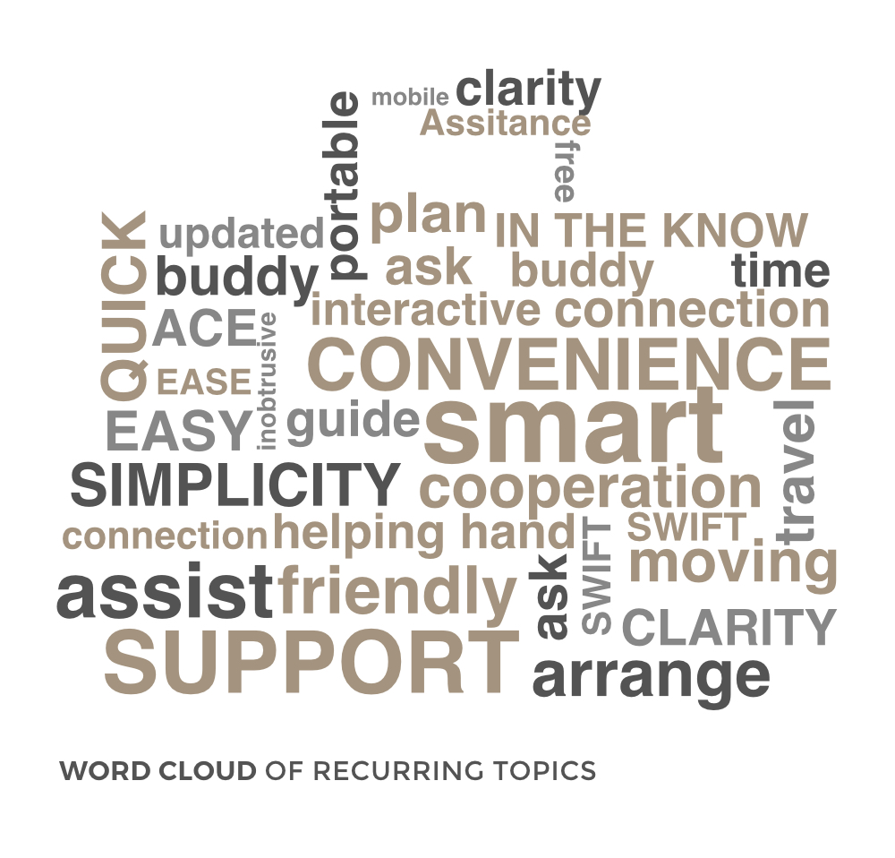
Word Cloud

Through our interview notes, we discovered a pattern of recurring topics that busines travelers want in a hotel experience. The following highlighted topics helped us launch our ideation process: Convenience, Smart, Easy and Support.

App Screenshot

Analysis & Information Architecture

Through our research methods, we were able to target our main persona and work out out her goals and needs. We also created a user flow based on our persona's core objectives for a streamlined hotel experience.
App Screenshot

Navigating the App

Persona

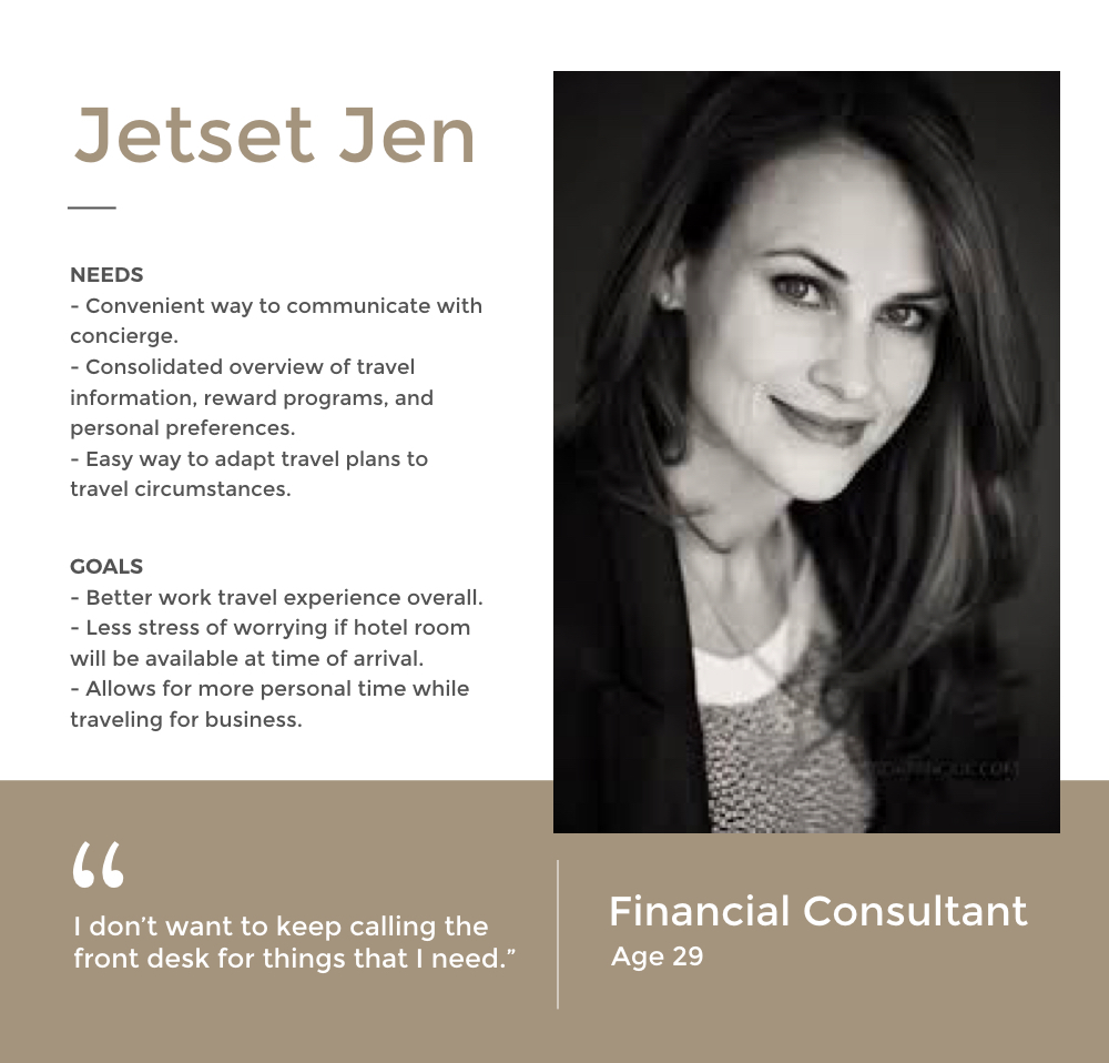
Our main persona - Jetset Jen - embodies all the characteristics, goals, and needs of the business travelers we interviewed. We initially had a secondary persona as well - Business Ben - but we eventually combined his needs with Jetset Jen's to create a more robust single persona.

Userflow

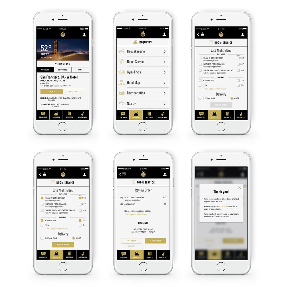
From there we synthesized our persona’s needs and developed a user flow that would create a solution for Jetset Jen, showing quick steps for Jen to order room service and send a housekeeping request using our app.

Designing, Testing, & Iterating

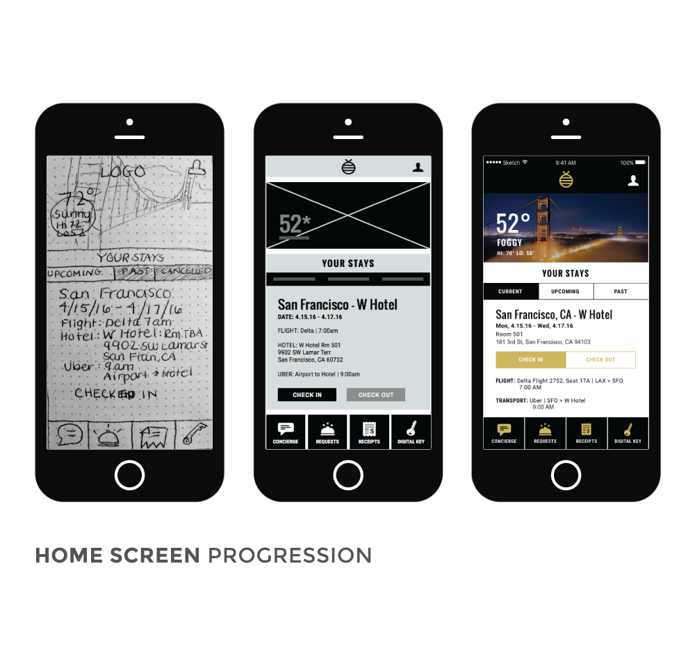
Once we determined our user flow, we were able to create sketches, wireframes, and finally a high fidelity prototype, always testing and iterating during each step of the process. We implemented a tool called Apptourage that helped call out usability errors, and conducted contextual inquiries to gain insight into the user's pain points.

Sketching & Testing
Paper Prototype & Contextual Inquiry

We first tested a paper prototype version of our solution and found usability errors using the Apptourage research tool. We also conducted contextual inquiries while users tested our prototype to get feedback during the process and find pain points in the design.

  • The key insights we derived from our usability tests were:
  • - Our target users wants to be reminded which app they are using upon opening it up
  • - They want to be able to view their flight info on the home screen
  • - They don’t need to see the stats for their trips that have been cancelled
Sketches, Wireframes, & Prototype

I sketched out the digital wireframes for our initial paper prototype tests, and later developed them into digital wireframes. Sara created the medium fidelity mockups, and we did another round of testing before I developed the high fidelity prototype.

App Screenshot
App Screenshot

High Fidelity Prototype & Next Steps
Final Prototype

The final prototype was successful during the last round of testing. Users found the menus easy to navigate, and the icons useful in increasing scannability of the app's functions.

  • Our final usability test notes included:
  • - Users completed the prompted task quickly without any hesitation or confusion
  • - Users were excited about having all of their travel info - flight, hotel, and transportation - all available in the same spot
Next Steps

For future iterations, we would like to undertake more user testing on the messaging feature for early check-in according to feedback we received. We would also like to perform Red Route analysis to find common user patterns for the rest of the app.