Responsive Website Redesign

Marbles: The Brain Store

Marbles is a specialty store that offers educational games, toys, and activities that are intended to strengthen & stimulate the brain. Marbles stores are renowned for their excellent customer service – sales associates give customers personalized product recommendations based on the recipient’s age and interests.

Project Overview

Challenge

Marbles customers are having difficulty finding products online because the current website does not provide the same tailored experience as in-store. Users find the website to be confusing, cluttered, and difficult to navigate.

Solution

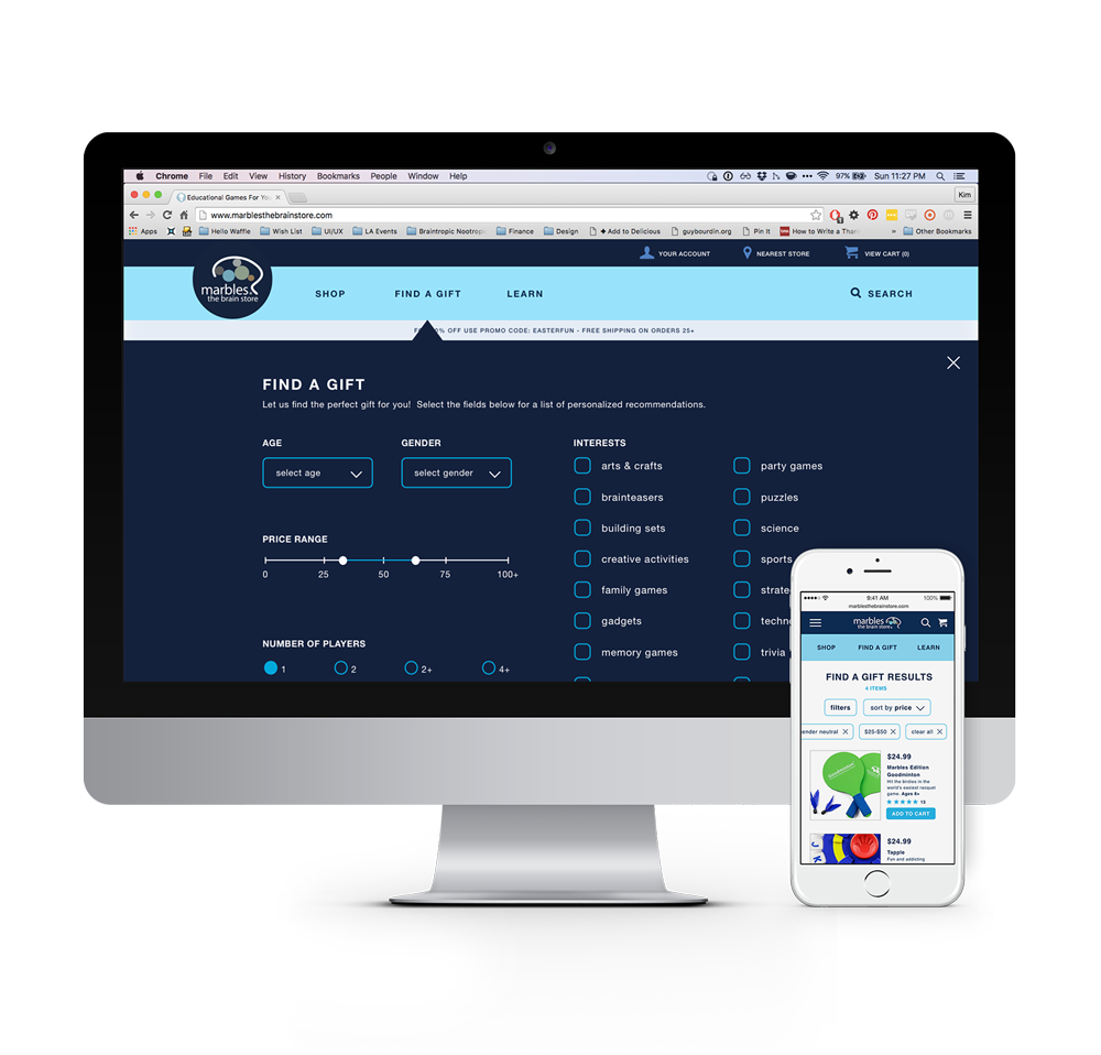
Create a “Find a Gift” feature – a tailored shopping experience that allows Marbles customers to have a simpler, consistent, and more focused interaction with the Marbles website.

Role

Researcher, Information Architect,
UX | UI Designer, Visual Designer

Methods

Interviews, Competitive/Comparative Analysis, Card Sorting, Contextual Inquiry, Wireframing, Usability Testing

Tools

Apptourage, Keynote,
Photoshop, Sketch, Marvel

Research & Key Findings

The bulk of my research came from interviews with Marbles store employees, competitive/comparative analysis with other retailers, and usability tests. Through these methods, I was able to identify the target user as well as flesh out their goals and needs.
App Screenshot

Initial Research & Development

Interviews

I started by taking a trip to a local Marbles store to observe the customers and interview the employees. According to the store manager, the employees, and my own observation, about 60% of Marbles customers are adults buying gifts for children.

Persona

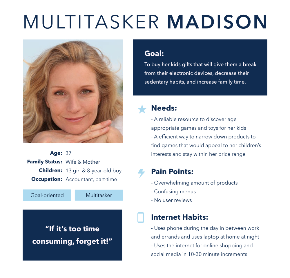
From my initial research, I built my persona – Madison, mother of two.

Heuristic Evaluation

I then performed a heuristic evaluation of Marbles’ current website and found that the menus were cluttered, repetitive, and the titles were unclear.

Working With Users & Key Insights

Contextual Inquiry & Card Sorting

I conducted contextual inquiries and card sorts with 5 target users and discovered the following key insights:

  • - Users will shop first by age, then price, then category, then guest reviews
  • - Users want the ability to shop by multiple parameters at once with a more stable filtering system
  • - Users are confused by the Brain Building categories
Competitive/Comparative Analysis & Resulting Breakthrough

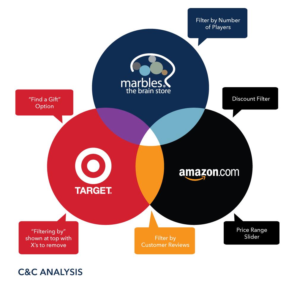
While conducting the C&C Analysis, I discovered the fundamental feature that would allow Marbles customers to have a more catered shopping experience – a Gift Finding feature that allows the customer to select multiple parameters before searching to tailor the product listing to the most suitable options.

App Screenshot

Analysis & Information Architecture

From the information I gathered in the contextual inquiries and C&C Analysis, I was able to prioritize the winning features and meld them together to redesign Marbles’ navigation. I then built out Marbles' new information architecture based on my persona's main objective to easily find entertaining gifts for her kids that are both age appropriate and wallet friendly.
App Screenshot

Navigating the New Website

Userflow

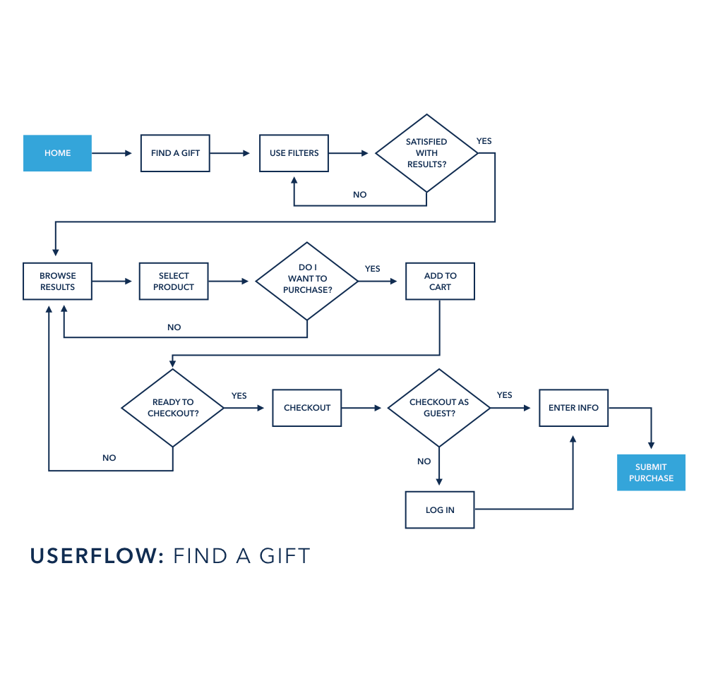
The user flow shows how my target persona would move through the site using the "Find a Gift" feature, allowing her to narrow down products using multiple parameters at once and quickly find gifts that suit her kids' ages and interests while remaining within her price range.

Sitemap

The new sitemap has a simpler, more streamlined navigation that caters to the target audience's preferences. Users can easily browse by their preferred topic, use the "Find a Gift" feature to quickly narrow down results, and discover products by Brain Building categories.

Designing, Testing, & Iterating

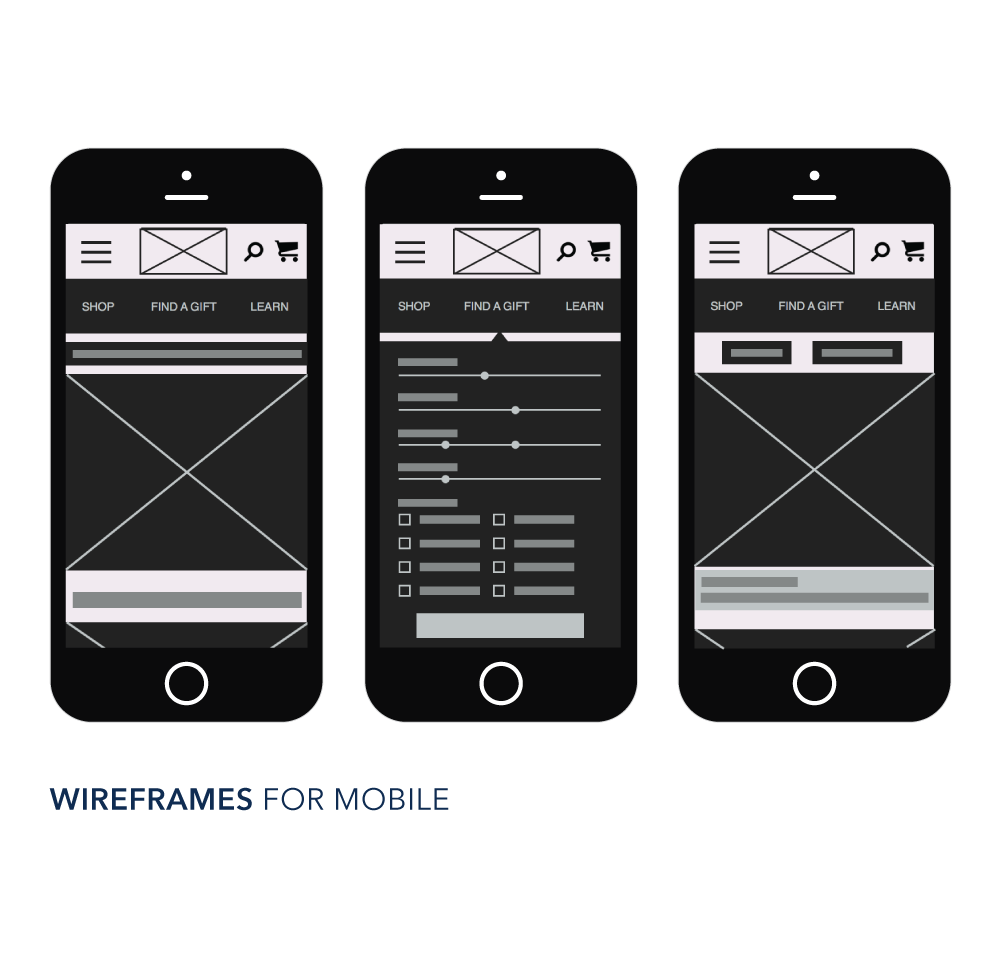
I developed the new responsive site with mobile in mind first in order to make sure it would be optimized for all devices. I first tested a paper prototype of the "Find a Gift" user flow to work out any pain points, and then began sketching both mobile and desktop wireframes on paper before refining them digitally.

Sketching & Testing
Paper Prototype

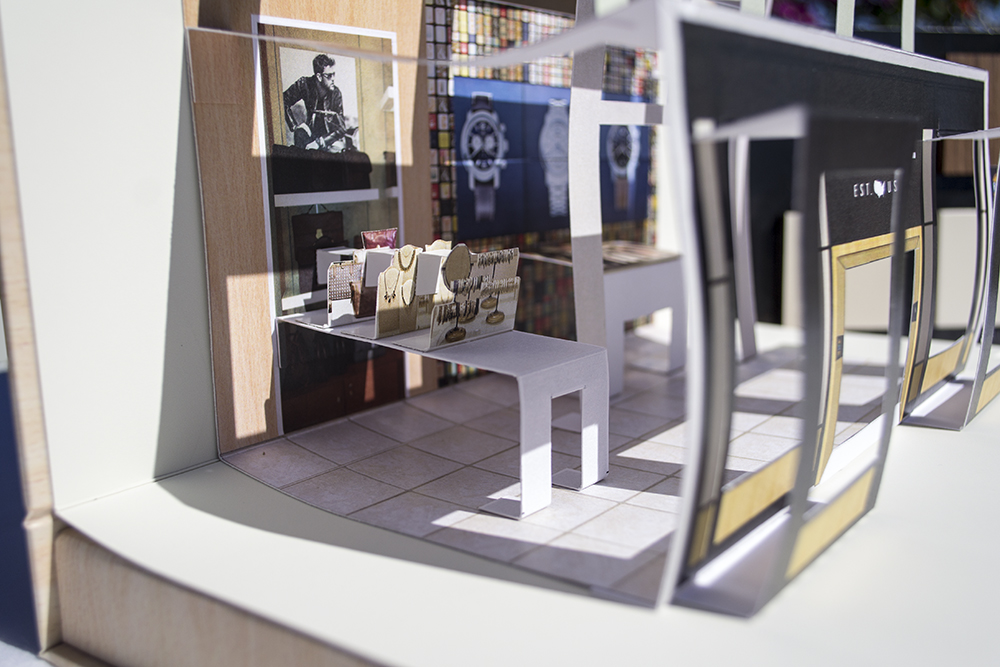
I created a paper prototype of the new navigation and performed 2 rounds of usability tests for the “Find a Gift” user flow (initially called 'Gift Genius'). I adjusted my design based on the usability test feedback, which included:

  • - Use clearer, action-oriented language in the Navigation Links
  • - Change the age slider and gender slider into drop-down menus
  • - Change the name “Gift Genius” to something more understandable
Refining Mobile & Sketching Desktop

Then, I began refining the modular designs and wireframes for the Mobile Site before expanding the design to desktop. I renamed the “Gift Genius” feature to “Find a Gift” so the user has a clear idea of what this function does.

App Screenshot
App Screenshot

High Fidelity Prototypes & Results
Final Prototypes

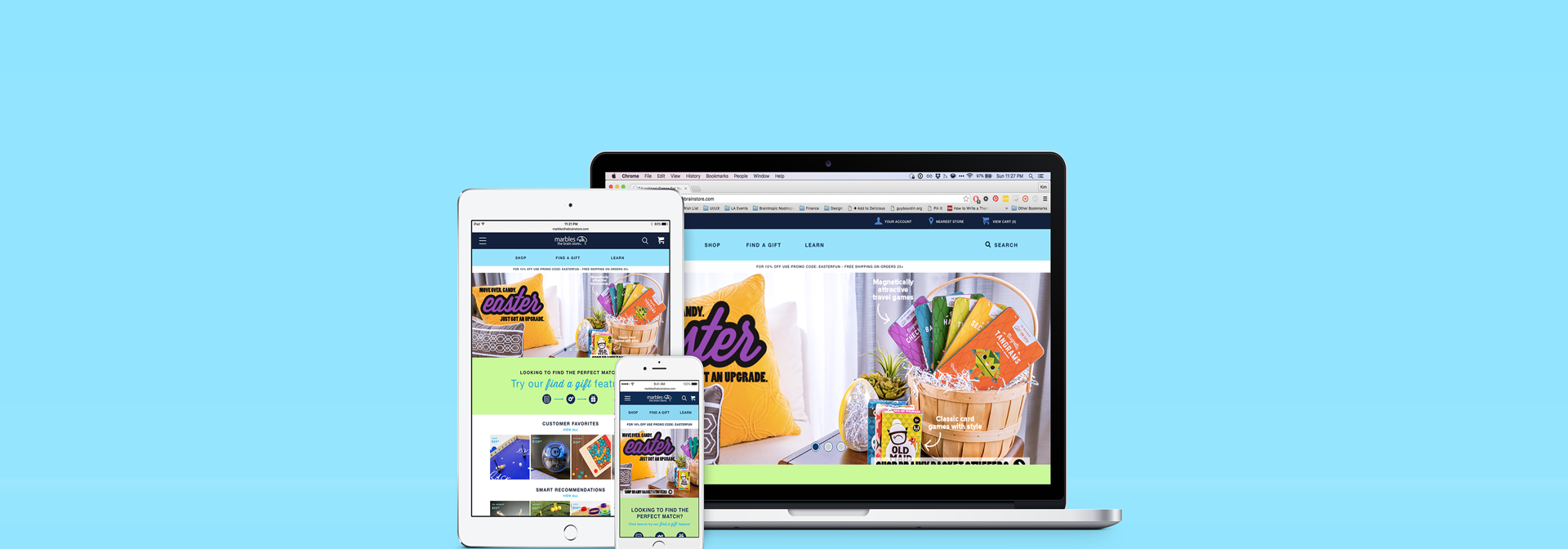
As I refined the wireframes into high fidelity prototypes, I made a few tweaks to the homepage to emphasize the Find a Gift feature. During another round of usability testing, many users would scroll down to explore the homepage before they would commit to clicking a link, so I dedicated a section of the homepage to explain what the feature does just in case any users feel unsure.

Results
  • - The “Find a Gift” feature provides a more tailored experience for the online shopper
  • - The navigation menus, categories, and product details at a glance are now simplified for more efficient wayfinding
  • - The language of the content is made clearer to decrease time spent on comprehension
  • - Elements of product content are arranged to focus on the info customers find the most important