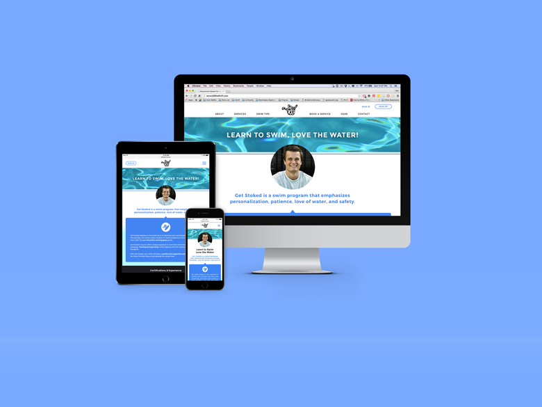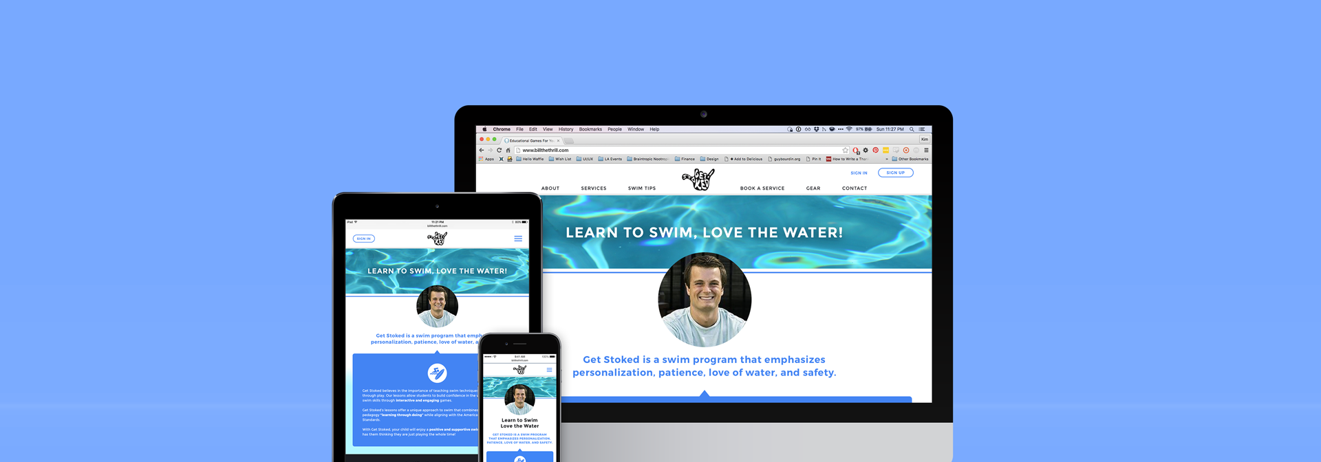
Get Stoked
Get Stoked is a swim program that emphasizes personalization, patience, love of water, and safety, and is owned and operated by the swim instructor, Billy. Our team redesigned his website to accurately reflect his level of experience and qualifications, as well as incorporate new features that increased efficiency on both the customer's end and Billy's end.
Project Overview
Challenge
Though the business goals of this project include 3 new features, we uncovered a larger issue our target audience had with the current website. Parents want a swim instructor that they can trust with their kids, and the current Get Stoked website doesn’t accurately portray Billy’s level of experience with kids and expertise in water safety.
Solution
Create a more robust front page for Get Stoked that includes Billy's teaching experience and qualifications, and build an account portal for customers so they can schedule lessons, make payments, and view lesson progress.
Team
I collaborated with Laura Podsiadlo and Armond Tsaturyan. We each contributed to the research, ideation, prototyping, and usability testing. As we reached the design phase, I spearheaded the mobile prototype, Laura brought to life the desktop prototype, and Armond lead the usability tests.
