User Research & UX Design

Revision SharePack App

Revision is a hardware solutions provider specializing in military-grade protective equipment, power management, and integrated systems. Revision recognized that modern day soldiers were in need of an eco-friendly power solution that is optimized for a soldier’s day-to-day use. As a result, they created the rechargable, versatile, and bomb-proof SharePack battery. All the battery was missing was an intuitive interface in the form of a companion app.
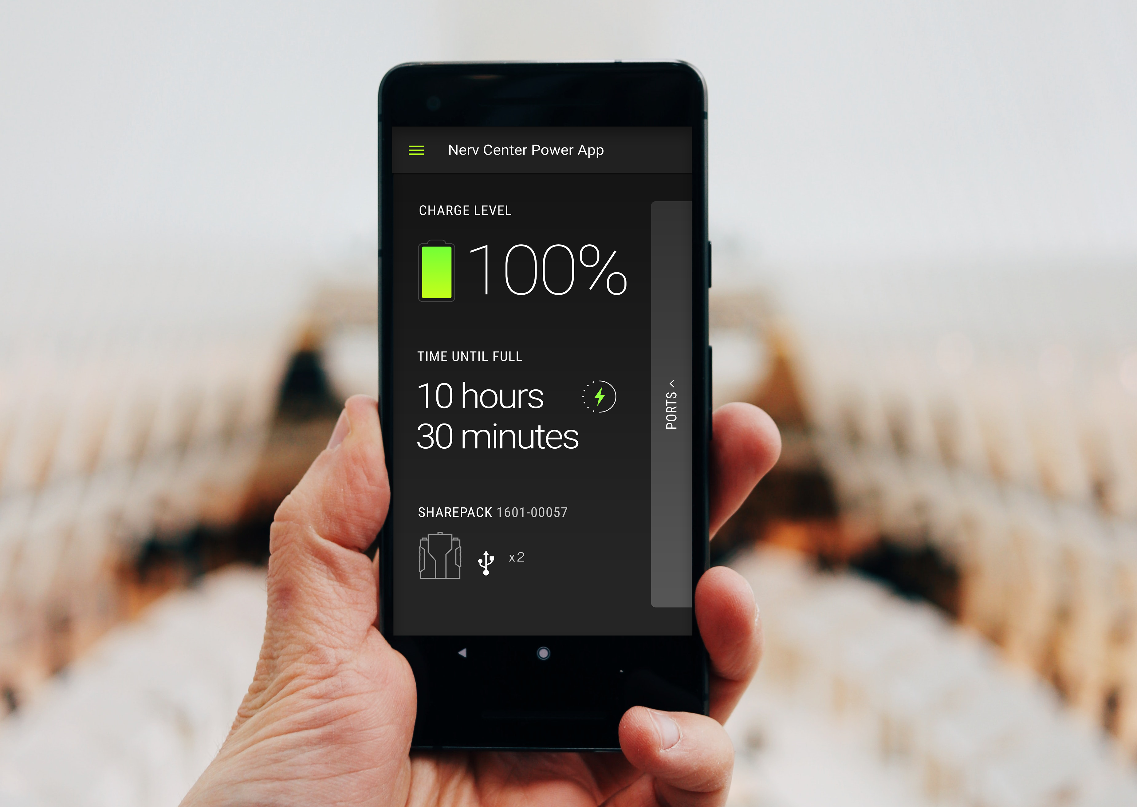
revision image

My Role

I was responsible for the user experience and final interface design of the iOS app. I lead the UX work, producing all major deliverables and presenting them to the client between May 2016 and March 2017. I worked alongside a Product Manager, who assisted in the user research and testing in the discovery phase, as well as a Creative Director, who created the style guide for the visual design of the app.

Project Overview

Challenge

The battery’s innovation and ease of use was hindered only by the tiny interface built into’s it’s front panel. Soldiers were having a hard time accessing the small screen while wearing the battery as a part of their gear.

Solution

For maximum flexibility, we decided to create a mobile and tablet experience that allows a soldier to control the battery from the palm of their hand, without ever having to adjust the physical battery’s position. Since the military provides the soldiers with Samsung devices, we determined the format should be Android only.
The Approach

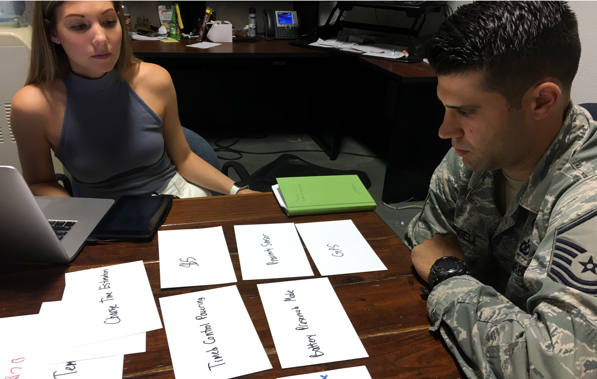
Understanding the soldiers' needs and the use cases for the battery's remote app was essential. In order to validate our assumptions and narrow down the MVP feature set, we traveled to a US Air Force Base to test out our lean prototype. There, we conducted user interviews, contextual inquiry, and several feature prioritizing exercises - including the $100 test and Kano model - before performing task analyses on the prototype with the soldiers. While unpacking all the feedback we received, we found an MVP starting to take shape.

revision image revision image

Key Takeaways

  1. User interviews and contextual inquiry revealed that during a mission, the soldiers use their smart devices in landscape mode. The vests they wear have a special compartment in the front that holds their device horizontally, and allows the soldiers to have hands-free access to it. This feedback helped us understand the need for the app to support both portrait and landscape orientation.
  2. While testing the prototype, soldiers emphasized the importance of push notifications generated by the app. Once on the field, the soldiers did not want to switch over to the Revision app to check on the battery. More time spent in the Revision app means less time in their military apps, which help them navigate their positions and track targets. We worked with the soldiers and the Revision team to hone in on which types of alerts should be pushed.
  3. Some of our initial assumptions about the app's potential feature set were incorrect. During the $100 test we conducted with the soldiers, our ideas for a "stealth mode" and "auto shut-off power to ports" were nixed. The use cases we has reasoned for those features ended up being common or important enough to make the cut for the MVP.
revision image

Final Design

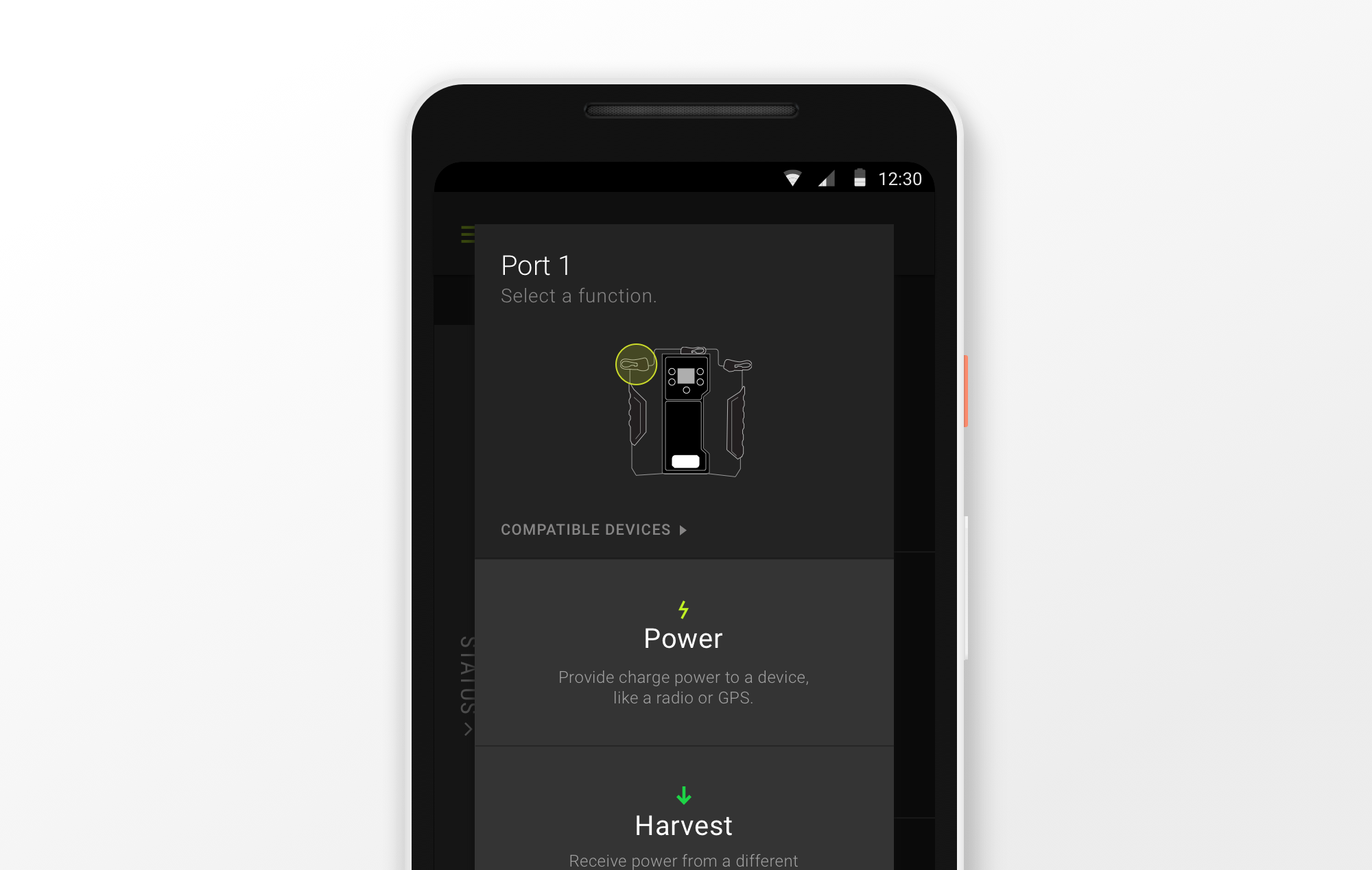
With the new companion app, the bigger screen called for more intuitive interactions, better learnability, and increased memorability. The final app design is flexible and adaptable for a soldier's day-to-day needs of controlling the battery pack. The app is compatible with any Android phone or tablet, and soldiers can fluidly switch orientations. This allows them to make changes to the battery before a mission in portrait mode, and later make tweaks on the field in landscape mode, when their phones are mounted to their vests. To further enhance the experience of using the app, our team created custom graphics to allow soldiers to quickly identify the different ports on the battery, and the pieces of equipment compatible to charge.